
What Color Is Your Tuesday
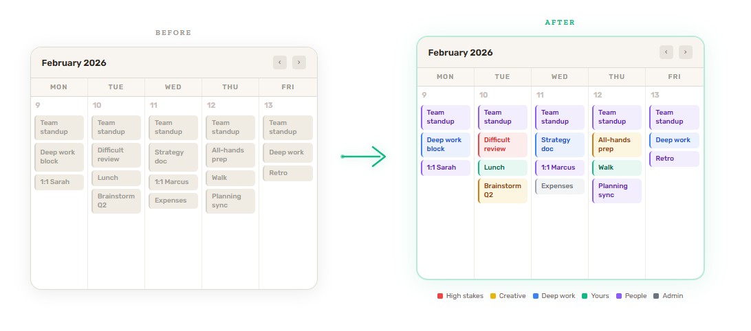
I used to start every Monday by opening my calendar and feeling vaguely anxious. Not because anything specific was wrong, but because I couldn’t tell, at a glance, what kind of week it was going to be. Everything looked the same. Thirty-something gray rectangles stacked on top of each other, each one demanding equal attention, none of them giving me any signal about what they’d actually cost me.
Then I started color coding my calendar. And I know how that sounds. But stay with me.
Your calendar is lying to you
Not maliciously. It just treats every event as equivalent, and they’re not. A difficult conversation with someone on your team is not the same as a lunch with a friend. A three-hour writing block is not the same as a status update meeting. A creative brainstorm is not the same as processing expense reports.
Each of those requires a different version of you. Different energy, different preparation, different mental mode. But if you’re looking at a calendar full of identical gray blocks, your brain has no way to prepare for what’s actually coming next. You walk into the hard conversation still mentally in the brainstorm. You try to do deep work right after something that drained you. You end the day wondering why you feel exhausted when you technically “got a lot done.”
Color coding solves this. It’s not about making your calendar pretty. It’s about giving your brain a heads-up.
The system I landed on
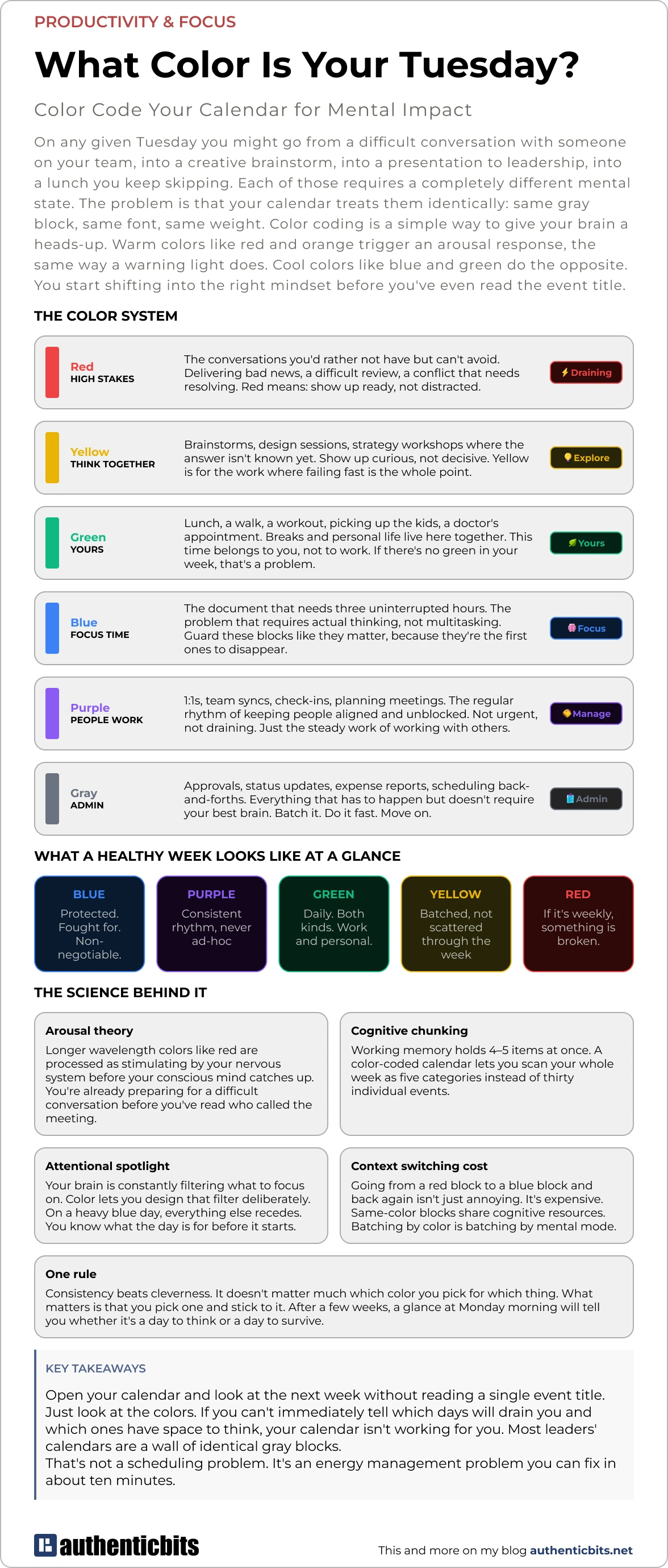
After trying a few different setups, I settled on six colors. Not because six is a magic number, but because it’s the minimum I needed to cover the genuinely different kinds of things in my week without adding so many colors that I’d need a legend to remember them.
Red — High stakes. The conversations you’d rather not have but can’t avoid. Delivering bad news, a difficult review, a conflict that needs resolving. Red means: show up ready, not distracted. Don’t schedule these right after something that requires your creative brain. Don’t schedule them at the end of a day when you’re already depleted.
Yellow — Think together. Brainstorms, strategy sessions, workshops where the answer isn’t known yet. Show up curious, not decisive. Yellow is for the work where failing fast is the whole point, so it needs a different headspace than a meeting where you’re expected to have answers.
Blue — Deep work. The document that needs three uninterrupted hours. The problem that requires actual thinking, not task-switching. These blocks are the first ones to disappear when your week gets busy. Other people’s urgency fills them in. Marking them blue is a small act of self-defense.
Green — Yours. Lunch, a walk, a workout, picking up the kids, a doctor’s appointment. I merged breaks and personal life here deliberately. Whether it’s a 20-minute walk or a school pickup, the signal is the same: this time belongs to you, not to work. A week with no green is a week where you’re running on fumes by Thursday.
Purple — People work. 1:1s, team syncs, check-ins, planning meetings. The regular rhythm of working with others. Not draining, not urgent, just steady. The glue that keeps things moving.
Gray — Everything else. Admin, approvals, scheduling back-and-forths, status updates. Stuff that has to happen but doesn’t need your best brain. Batch it. Do it when your energy is already low. Move on.
How to actually set it up
In Google Calendar, right-click any event and pick a color from the menu. You can also color entire calendars at once — if your personal calendar is already separate from your work calendar, that gets you green blocks everywhere immediately without touching individual events.
In Outlook, open an event and use the “Categorize” button.
If six colors feels like too much to start with, just do Red and Blue. Two colors will already change how you read your week. Add the others as it becomes natural.
Plan on spending 10 minutes at the start of each week going through upcoming events and tagging them. That’s it. After a couple of weeks it becomes automatic.
What to look for
Once your week is color coded, the picture tells you things you’d never notice otherwise.
A good week has a decent amount of blue, some purple, and green every single day. Yellow shows up occasionally, ideally clustered so you can get into a creative headspace and stay there. Red is rare.
A bad week is obvious. Too much red clustered together with no recovery time around it. Blue blocks that keep getting eaten by other things. No green anywhere. When you see it visually you can’t pretend it isn’t happening — and you can do something about it before the week starts rather than after it ends.
That’s the real value. Not the color coding itself, but what it makes visible. Your calendar stops being a list of obligations and starts being an honest picture of what you’ve agreed to do to yourself this week.
Most weeks, that picture is more useful than any retrospective.